i finally got our wedding website designed! i ended up with 6 different layouts, haha. i just couldn't decide. but we finally picked our top 3. what do you think? you know i love designing with scanned elements and textures. the design elements from puglypixel are so helpful too! (they're free! download some for yourself!)
the beautiful calligraphy titles are written by the sweetest ever katy from kisforcalligraphy: whom ive been fortunate to meet at renegade and will see her again in a couple weeks in sf! (visit her shop, flickr, twitter, and blog!)
anyway, here are the layouts!
help me decide?
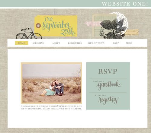
one.
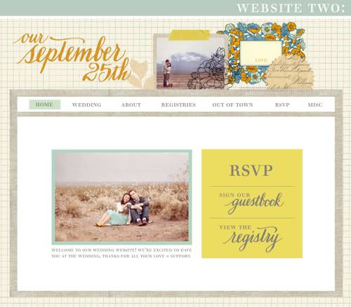
two.
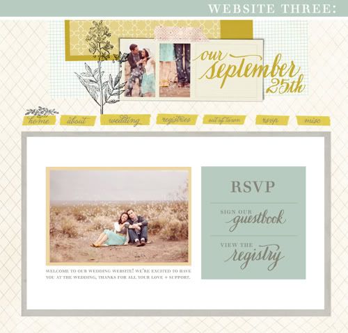
three.
so what do you think: one, two, or three? or none! ;)
xo.






#1 is hands down my favourite.
ReplyDeleteONE! :)
ReplyDeleteSuch a tough choice--they're all beautiful! But I think I like #3 the best. I love the handmade feel of how the navigation buttons are! Great job on them all, Danni!
ReplyDeleteI love #1. Seems more your style.
ReplyDelete#3, for sure. I love the arrangement of the elements at the top, and the way you did the menu bar with the yellow behind the words. LOVELY!
ReplyDelete#1 is definitely my fave!
ReplyDeleteYou really did a great job on all three! My fave is #3.
ReplyDeletei like #2 the best, i love the yellow boxes and the gorgeous flowers & cursive script at the top right. but i also love the top middle pictures from #3 with y'alls feet...so i might move those pics up to #2!!
ReplyDeleteI love #3!
ReplyDelete#1!!!
ReplyDeleteDefinitely #2!
ReplyDeleteI love love love these designs but my absolute favorite is #2! Congratulations!!
ReplyDeleteoh how pretty these are. :) Hard to choose, but I vote for number three, two, one. :) Supercute. Have fun planning the wedding! :)
ReplyDeleteNumber THREE most defiantly, but I will say I like the simplicity of the navigation buttons on the first two better. Good Luck! Your site is such a joy to read everyday.
ReplyDelete#2 really grabs my eye. The elements seem to go together better than the other two.
ReplyDeleteOh i love the #1 and #3!! It's hard to choose because they are all beautiful!!
ReplyDeletexoxo
Beautiful!!! So hard to decide!!! #2 and #3 both really are my favs. <333
ReplyDeleteNo. 3 is my favorite, but they're all lovely!
ReplyDeleteCute. Very vintage... I like 3 the most.
ReplyDeletethose are all awesome...I think that my favorite is #3. ;)
ReplyDeleteI love the yellow of the second one but the photo of the third one.
ReplyDeleteone :)
ReplyDeletexo
Oh my gosh, seriously. I am no help, because I love them all! Of course, I am a font freak, so I love all of the fonts too. So I'm afraid I cannot be of any help. Sorry! :)
ReplyDeleteBut at least you know that they're all pretty!?
♥ Amber
Silver Lining
hmm... i think you prefer 1 & 2 more as they are similar to each other. So in that case I would say two. your photo stands out better in the green border.
ReplyDeleteI really like #1!
ReplyDelete#2 for me!tough choice, coz i really like the two smaller pictures in #3!
ReplyDeletethe first one is the best i think. it's soooo you!! love it.
ReplyDeleteI vote for #3. I like all the hand written tabs and extra photos in the collage at the top.
ReplyDeleteone!
ReplyDeleteI vote for #2 :D
ReplyDeletei love #3, but they are all lovely!
ReplyDeleteDefinitively number one!
ReplyDeleteI'm going with #3!
ReplyDelete#3... the header is balanced perfectly!
ReplyDeleteI vote for #3!
ReplyDeleteI like the header and the buttons there are original and keep your page interesting all the way through!
Congratulations!
they're all fabulous (of course), but my favorite is #3!
ReplyDeletexo
Kelly
I love them all! Number 3 sticks out to me more then the others :)
ReplyDeleteI love all of them, but #3 is my favorite, then #1! You are so talented!!
ReplyDeleteI love all of them, but #3 is my favorite, then #1! You are so talented!!
ReplyDeletethey're all lovely (:
ReplyDeleteI'd say #1 or #3 (:
Well, it was between #1 and #3, but I think tres is where it's at. But all are incredibly lovely. You are one gifted girl and that Jonathan is lucky!!!
ReplyDelete#2!
ReplyDeleteThey are all lovely though.
They all look great, but #2 is my favorite. The yellow really pops.
ReplyDeleteThey all look great, but #2 is my favorite. The yellow really pops.
ReplyDeleteone!
ReplyDeleteone!
ReplyDeleteI like 2! The orange and blues of the little frame really make the page pop.
ReplyDeleteI love them all, but ONE is my favorite. Just love the bike :)
ReplyDeletethese are all great but I have to say #3 is my fav
ReplyDeleteomg! what a hard decision! torturous!!!!!!!!!!!! i am the worst at making decisions but if i make my decision just based on the feeling i got when i looked at each one, i'd vote for #3... there's something about that flower thingy that i love... it's beautiful!!!! awesome job!
ReplyDeleteNumber 1 or 3 for me. Love your eye for design! Best wishes!
ReplyDeleteFan,
Claud :)
They're all good but I like number 1 the best!!! :) speaking of weddings, I just posted some bouquets i made..check it out when you get a minute..thanks!
ReplyDeleteyou can't go wrong with either design, but i absolutely adore #3!! you are sooo creative danni!! i love the use of the yellow as the menu bars and the banner the best with those cute engagement pictures!!! ahhh it's coming up soo soon, soo exciting! :)
ReplyDeletenumber 2 is my favorite!
ReplyDeletei love number two. the pop of blue and yellow is perfection.
ReplyDeleteall three are so beautiful!
ReplyDeletebut I adore #3!
I love #2! Has enough detail to entertain the eye but isn't overwhelming! :) All are beautiful!
ReplyDelete#1 simplicity and I love the bike!
ReplyDeleteAll of them are lovely!
ReplyDeleteMy favorite is #3.
Number 1!
ReplyDeletemy goodness, Danni. all 3 are equally gorgeous -- this is really tough! let's see... the first one -- i'd go with the first. :D
ReplyDeleteanyhow, love the color scheme you chose and how you incorporated all the elements together so cohesively. beautiful!
I'm really drawn to the third. I love the pops of color.
ReplyDelete#2 is my vote!
ReplyDeleteReasons I think you should pick #2:
ReplyDelete~I like the boldness of the calligraphy on top.
~The brighter tones add warmth and cheer to the page.
~The colors better complement your photos and let your blue skirt pop, instead of matching other design elements to that blue.
That's my two cents!
Oh wow this is a tough choice! I think I like #1 best though. It's the simplest, and has such a nice clean layout. The other two are more chaotic and scrabook-y looking. I think for a wedding, you'd want to keep that minimalistic feel.
ReplyDeletei agree, they're all beautiful! my fave is #3!
ReplyDeletei agree, they're all beautiful! my fave is #3!
ReplyDeleteI love #1!!
ReplyDeleteI love the header for #3!! But I like the yellow of #2. Combine!! :)
ReplyDelete(I'm so excited!! :)
all of them are cute and fantastic, but I also choose number 3! congrats!
ReplyDeleteI vote for #1, but would you consider not putting such a big "view our registries" link? Maybe I'm just hyper-sensitive because I do invitations where the mantra is "don't mention the registry". I like having the little link at the top, though!
ReplyDeletelove #1 because of the sweet little bike :)
ReplyDelete# 1
ReplyDelete- 3 is nice but too busy
I'm partial to #3, but it looks like each one is a favorite here, so you can't go wrong.
ReplyDeleteCongrats!
#3 -- most appealing to my eye.
ReplyDelete<3 ALL 3! ... that doesn't help you much, but they all look UH-mazing!
ReplyDeleteI like number one the bets. :)
ReplyDelete*best. ooops. :)
ReplyDelete#1 is awesome
ReplyDeleteAh! They're all beautiful! But if I had to choose only one... I'd say #3. But then again, I like them all. What if you could make it switch layouts every few clicks/days/etc.?
ReplyDeleteLOVE them all!! This is going to be the best wedding website EVER!! Can't choose but #1 and #3 are my favs!
ReplyDeletein LOVE with #2!
ReplyDeleteThis is terribly un-helpful, but I'm completely torn between 1 and 2! They're both just gorgeous, of course!
ReplyDelete- Lindsay
Aw, they all look beautiful! I'm putting in my vote for 1 or 3.
ReplyDelete#1 and #3 are both lovely! You did such a great job!
ReplyDeleteI can't decide between #1 and #2! Nevertheless, I wish you much happiness Danni!
ReplyDeleteThey're all gorgeous! But I prefer the number one!
ReplyDelete#2 is my favorite. It just pops.
ReplyDeleteThey are all lovely. I really love #1 the best :)
ReplyDeleteHi Danni,
ReplyDeleteNumber three is my favorite. I love the color choices and the banner layout.
Kristen
Three!
ReplyDeleteAll are nice but I love 3!
ReplyDelete#1 ! :)
ReplyDeletethey all look beautiful! but I think #3 is my favorite - although honestly can't go wrong with any. congrats :)
ReplyDeleteI LOVE #1!
ReplyDelete3 3 3!!
ReplyDeletei love that there are more photos on that one. =)
Love #1 or #3! Beautiful work!!
ReplyDeleteI like #1 with #3's menu bar design. If they were combined, I think it would be beautiful. But definitely #1.
ReplyDeleteAbsolutely beautiful! They reflect your style too which is awesome. I love all of them but I like the way your eye is drawn to the picture of you two in #1 and #3.
ReplyDeleteSo exciting!
number one is my lear favourite. They are so lovely- if I I got an invite that led me to any of these sites I would be sooo exited about the wedding!!! Good luck with all your planning. Anna x
ReplyDeleteYes.. it's a hard decision! I like #3 the best!
ReplyDeleteI would say the first one because the bike at the top is nice.
ReplyDeletethey're all beautiful, but my vote goes to number three. it has that extra punch of color and will surely get everyone excited for the big day!
ReplyDeleteThey are all lovely....
ReplyDeletebut I ♥ #3.
Love #1!
ReplyDelete#1, I like the vintage look.
ReplyDeleteThey are all beautiful! I love the navigation on website 3 and I like the background texture on website 1. But if I had to choose just one, I'd choose number three.
ReplyDelete:)
~ ONE ~
ReplyDeleteThe bike is the clincher! I noticed the other versions had a picture at the top (right side) - could a small picture of the wedding couple be added? maybe they could be standing near a bike rack in the middle of nowhere??
3!! ^.^
ReplyDeletei love 1 + 3 -- what a great site. xo!
ReplyDeleteI love #2! Great job!
ReplyDeletelooks like you've already got a lot of feedback, but i love number one!
ReplyDeleteI vote for #1 :)
ReplyDeleteI keep coming back to no. 1 - so awesome! I love the bicycle and that the only photo is the main one.
ReplyDeleteThis comment has been removed by the author.
ReplyDeleteI think that #1 would fit you well. But since it's for your wedding, I love #3 because it's your style, with a little twist & there's more pictures of you & the love of your life, Nick! :D
ReplyDeleteThey are all lovely but #2 is my favorite!
ReplyDelete#1 - it's simple and easy to look at, as well as being gorgeous.
ReplyDeleteI like #2 :)
ReplyDeleteI like the background from number one, the main box and menu buttons from number two and the header from number 3 (for a totally different look!)
ReplyDelete#3!
ReplyDeleteI like #1 very much.
ReplyDeleteAll three of them are perfect! How do you decide? I say you just draw the winning number out of a hat :)
ReplyDelete# 3 looks so fresh, romantic and lovely! Hard decision though as they are all so pretty.
ReplyDeleteohmygosh. these are ALL beautiful. i am so impressed.
ReplyDeletei love #2 the most. the flowers are so pretty!
#3 is the most beautiful, although they all rock! ;)
ReplyDelete1 or 3!!
ReplyDeleteAll of them are beautiful but my fav one is #3 =)
ReplyDeleteI love them all, but my favorite is #3.
ReplyDelete#2 for sure.
ReplyDelete#3 so cute!
ReplyDeleteOne ! ^^
ReplyDelete#1! :)
ReplyDeleteMy vote, in order:
ReplyDelete#2
#1
#3
:)
I'm loving #1...I think the background is just enough texture without being too distracting.
ReplyDeletequestion... what font is "our september 25th"? it's super cute!
ReplyDelete#1!
ReplyDelete#2 is my favorite. i really like the blue framing the photo.
ReplyDeleteAll of them are lovely, of course! But I think #2 is ballanced the best with the content underneath.
ReplyDeleteI like #3 the best! #1 is beautiful, but it reminds me a little too much of D*Sponge's background
ReplyDeleteI love all of them, but I think #3 because it has the extra pictures of you two.
ReplyDeletei like version 2, i like that pop of yellow/green that you've got going on. plus it's more personal with the picture in the header and all...
ReplyDeletebut they're all pretty. :)
I like #1 (because it has no border around the main text) and #3
ReplyDeleteWhere did you make your website at? Im looking to make my own wedding website and have no idea where to start! hah I choose number 3!
ReplyDelete#2! So pretty, fresh, fun and pleasing to my eyes! :)
ReplyDelete1! It suits the style of the engagement photos SO well and it looks just different enough from this site to be perfect ;) I love it.
ReplyDeleteI love #1!!! What about replacing the bicycle with a tandem???
ReplyDeleteMy favorite is #3! I love the taller floral graphic at the top and the two small shots of you as well.
ReplyDeleteONE!!
ReplyDeleteONE!!
ReplyDeleteThree those photographs are too beautiful not to feature! G
ReplyDelete#1 or #3!
ReplyDeletewell, I like two and three, but coming from a person who has changed her site more time than she has had hot diners, I could change my mind again. :)
ReplyDelete#3!
ReplyDelete3!
ReplyDeleteI love the little details.
They are all beautiful.
all of them are beautiful, but i think i like #2 best. good luck deciding :)
ReplyDeletexoxo,
lesley
#2 hands down!
ReplyDeleteI was going to say #2 but then I looked closer at #3 and now I can't decide! Hmmm... I guess I'll go with #3! :)
ReplyDelete#3. But all of them are great!
ReplyDeleteThey're all wonderful, but the vote goes to #1.
ReplyDeletei like #2 i think it suits you more!!
ReplyDeleteCan;t wait to see it all unfold!
Megan
I realize I don't know you, but no. 1 reminds me most of your blog and the photo collections you've posted (including your engagement photos). So from a total stranger, website no. 1 is totally you =)
ReplyDeleteOh, I love No. 2. Though they are all very lovely!
ReplyDeleteI like # 3!!
ReplyDeleteI like the layout from #2 and the banner from #3.
ReplyDeletethanks for sharing Danni! Hope you decide on a layout and congrats on your upcoming wedding!!!<3333333333333
There all gorgeous, but for some reason I'm drawn to #3
ReplyDelete#2. Love how the layered graphics and text are a little off-balanced and not so symmetrical.
ReplyDeleteBut I don't think you will have a winner from your blog readers. Looks like every layout is getting equal votes! That's how good they are. You're genius.
#3!
ReplyDelete2!
ReplyDeleteThey're all adorable, but I like 1 best. :)
ReplyDeleteJust found your blog.. I like #3 the best!
ReplyDelete2! definitely. but it all depends on what fits you best. which one do you look at and it brings the most emotion?
ReplyDeleteI love them all, but I think number 1 is one for a reason..it completely suites you guys! My vote = #1
ReplyDelete~Sasha-Shae
http://afroniquelyyou.com
#3! I was so drawn to #1 because of the bicycle, so perhaps you can incorporate it into the 3rd layout? I do love how you used the tape designs for your navigation bar. Cute!
ReplyDeleteThey are all gorgeous but I think maybe #1 :) I hope you can decide.
ReplyDeleteThree
ReplyDeletethree!
ReplyDelete#1 is the best, it's so simple and elegant, and it focuses on your wedding more, the design elements in the other two seems to have taken over the actual wedding I think.
ReplyDeleteone! sept. 25th is my mom's bday :)
ReplyDeletethey're all beautiful - but no.3 is my favourite. everything just sits together really well. good luck deciding :) x
ReplyDeleteone(!) i love.
ReplyDeleteone!
ReplyDeleteTWO!
ReplyDeleteIt probably doesn't help, but I say one or three :)
ReplyDeleteFor some reason, number one seems the most like you to me. With that said, I don't actually KNOW you, but I feel like I know you in the blog-o-sphere way :) No matter what, they are all so lovely! I can't wait to hear more about your wedding plans!
ReplyDeletehttp://over-thinkersanon.blogspot.com/
I'm going with #1!
ReplyDeleteI'm going with #1!
ReplyDeleteThis might not be too helpful...but, I like the extra photos of you on # 3 - I like the unstructured layout of # 1 - and I like the flowers on #2...Now put those all together and presto! :) You do beautiful work - they are all wonderful.
ReplyDeleteone! :) I love these, they are gorgeous!!!
ReplyDeletexoxox Holly
Number 2!
ReplyDeleteLOVE #1! beautiful! :)
ReplyDeleteI vote # 3 but take out the heavy yellow rectangle at the very top. Congratulations!!
ReplyDeletei love puglypixel! Katrina always has amazing free downloads!
ReplyDelete#3!!
ReplyDeletetwo! i love how the date really pops out on the left side and how everything just come together. i love the other two too, but they just dont catch my eyes as much as the second one.
ReplyDeletei would have to vote three because of the bright banner at the top and the lovely yellow menu/tab items which really catch your eye.
ReplyDeletei love three! i think the scrapbook theme and handmade feel is just what you're looking for.
ReplyDeleteNUMBER 1: ELEGANT, SERENE, WHILE STILL BEING UNIQUELY YOU.
ReplyDeletei vote for #3! i love that there are engagement pics in the header. gorgeous! :D
ReplyDeleteI like #1 the best, though they all look great.
ReplyDelete