I actually made several layouts and thought I'd ask you guys which one you like best! Just let me know in the comments below ;) Excited to get the new blog design launched soon!
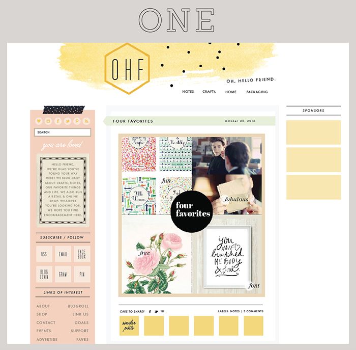
2 columns on both sides with content in the middle.
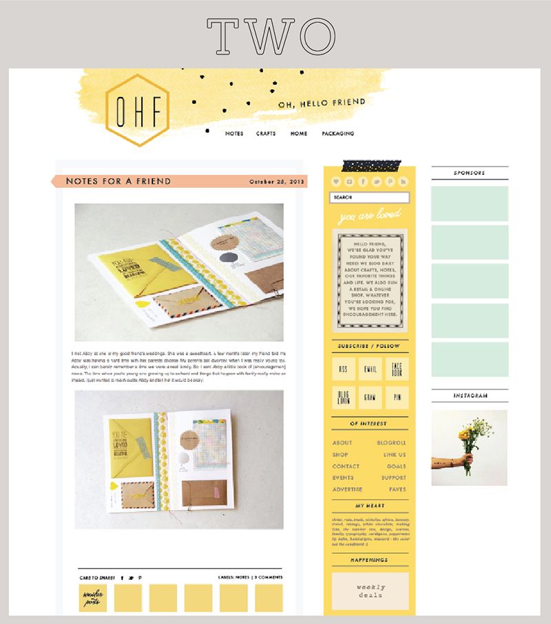
Similar to current layout, 2 columns on the right side.
hello :) number three is the most beautiful, according to me. i really prefer two columns instead of three and the color palette is more delicate oh... and i'm a pink lover so definitely three :)
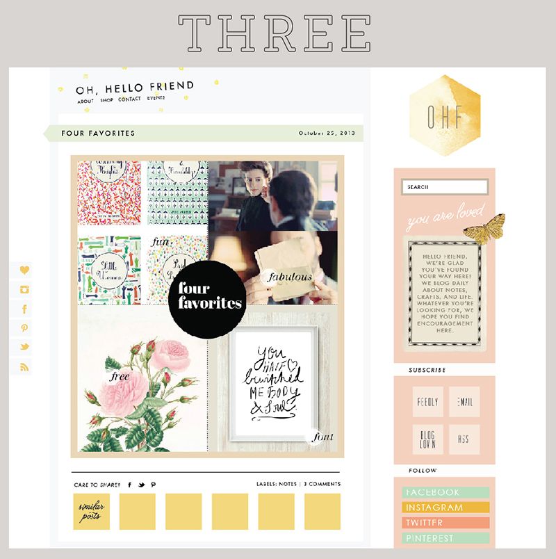
Nr 3 is the layout where you can see the content more, not only it is on the left but also bigger. Two colums gives more clarity too, I believe. Too many things might be distracting. Either than that all of them are visually interesting and beautiful.
My favorite is #3. I'm never been a fan of blogs that have too many columns. If I had to choose a second layout and go with #1. Love the colors you used on all 3 by the way. :)
Three. Cleaner & better color palette. As another said, it helps keep the content front and center as the main focus. Also like the smaller social media icons - more recognizable for those looking for them and take up less space than larger, typed-out headings for each.
You are so talented! These are all beautiful. My favorite is two--I like having everything on one side. 3 is my second favorite. So excited for you! With every redesign, your site gets more and more lovely. But I like how they all have a similar feel and color scheme.
Wow, I love them all, so well done! But layout one is my favorite. Love the three parts with the blog posts in the middle. And the black tape on top of the left column. :) Have a great weekend, much love, Eva
#3 all the way. I think for new readers having the actual name of the blog in the dominant position will be less confusing. I've been reading your blog for years and am still not fully aware of the OHF. Just a suggestion!
Friends, Thank you so much for reading + supporting my blog, and for taking the time to leave me a comment. Your comment support truly means so much to me. Have a lovely day! xo, danni


I would say 2 or three, I prefer the main content on the left. They all look lovely though
ReplyDeleteI'm a fan of #2. goodluck on your decision!
ReplyDeleteI prefer #1! :-)
ReplyDelete2!
ReplyDeleteNumber three! Having only one side bar allows the focus to stay on your blog content!
ReplyDeleteNumber three! Having only one side bar allows the focus to stay on your blog content!
ReplyDeleteNumer Three! It looks really sweet!
ReplyDeleteI like 3
ReplyDeleteputting in my vote for #3! ^^
ReplyDeleteNumber 1!
ReplyDeletehello :) number three is the most beautiful, according to me. i really prefer two columns instead of three and the color palette is more delicate oh... and i'm a pink lover so definitely three :)
ReplyDeleteI like the colors in #2, but with the column layout in #1.
ReplyDeleteI like OHF icon and the social media icons on #3 however.
Combine them all! (:
2!
ReplyDelete3, or 1. :)
ReplyDeleteI like 2 which is pretty similar to the current layout. Maybe I have an aversion to change. LOL.
ReplyDeleteI like 1 or 3.
ReplyDeleteNumber 3!
ReplyDeleteI like THREE!
ReplyDelete3!
ReplyDeletei like the third layout the most!! how fun :) xo jillian - cornflake dreams
ReplyDeleteI love #3!
ReplyDeleteI love 2! The new look is going to be so bright and airy - beautiful! I just overhauled mine, too. It's always nice to get a fresh start.
ReplyDelete1 or 3:)
ReplyDeleteI would go with 3 or 2.
ReplyDelete1 has the main sidebar in a similar way yours is now.
2 Is super happy and clean (love it!)
3 is different from most things out there (so is 2).
Two or three! much easier to see everything.
ReplyDeleteI like #1! I do like the yellow side content in #2 though
ReplyDeleteTHREEEEEE!! It is perfect!! And the logo too !!!!
ReplyDeleteI absolutely adore #2!
ReplyDeleteI choose V3!
ReplyDeleteI like one and three :) but three I think just a tadddd bit more :)
ReplyDeleteLove #3!
ReplyDeleteOne or three is my favorite!!
ReplyDelete3
ReplyDeletethree
ReplyDeleteI love # 2!
ReplyDeleteNr 3 is the layout where you can see the content more, not only it is on the left but also bigger.
ReplyDeleteTwo colums gives more clarity too, I believe. Too many things might be distracting.
Either than that all of them are visually interesting and beautiful.
Three!
ReplyDelete3 or 2 :)))
ReplyDeleteI'm partial to #3, but all do look gorgeous. Looking forward to see which you choose!
ReplyDeleteI love number 3!
ReplyDelete333 THREE 333!!!
ReplyDelete3!!
ReplyDeleteNumber three, no doubt about it!
ReplyDelete#3
ReplyDelete1 or 3. 2 distracts my eyes.
ReplyDelete#3 = Less cluttered
ReplyDelete1. I like the blog in the middle!
ReplyDelete3
ReplyDelete3! It's much less busy! Have fun!
ReplyDelete#3 looks the least cluttered and it'seasier to focus on your posts.
ReplyDeleteI like #1 but I also like the SM buttons on the left in #3 =D
ReplyDeleteOh my, my! Number 3 is swoon worthy!
ReplyDelete-Zie Darling
I like 1 and 3
ReplyDeleteOne or three! Lovely style!
ReplyDeleteI love #3! :)
ReplyDeleteNumero tres!
ReplyDeleteThe second one is the best.
ReplyDeleteMy vote is #3 - go for the big change!
ReplyDeleteLike most others that I see here, I'd go with #1 or #3 too! :-) I think #3 probably is my favorite though ... it looks more unique.
ReplyDelete1. I love 2 & 3, but I think 1 suits your blog so well.
ReplyDeleteI love the simplicity of 3 :)
ReplyDelete2
ReplyDeleteLove 3! Simple and Easy on the eyes!
ReplyDeleteI like #2 best! :)
ReplyDeleteNumber 3!
ReplyDelete~Sara
Sincerely, Sara
i lean towards one or two. i like the color scheme of those the best.
ReplyDelete#1!!!
ReplyDeleteone!
ReplyDelete3
ReplyDelete2 2 2 2 2 2!!!
ReplyDelete2
ReplyDeleteI love number 3
ReplyDeleteI like 3! 1 is also pleasing to look at, but 3 is my first choice :) Happy launching!
ReplyDeleteONE! :)
ReplyDelete3 :)
ReplyDelete#2! I love yellow. :)
ReplyDeleteI love #3! But I really really love the yellow brush banner in 1 and 2. :D All beautiful!
ReplyDeletei love the top banner in one and two and the pink sidebar. and my favorite layout is three. did that help? :P
ReplyDeleteI like number one. More balanced. Will you be developing the blog by yourself or do you have a partner for coding etc?
ReplyDeleteI think layout #3 works best, less busy. But like the header and yellow column of #2.
ReplyDelete3!
ReplyDelete3 for sure!
ReplyDeleteThree is the most fresh & open— but all very pretty!
ReplyDeletenice work ! :)
Love all three, but my vote is for #2
ReplyDeleteHard decision...but 3 gets my vote
ReplyDeleteHard decision...but 3 gets my vote
ReplyDeleteI love number three - it's simple and pretty :)
ReplyDelete#1!!! very pretty!
ReplyDeleteThey're all gorgeous, but #3 is my favorite!
ReplyDeleteMy favorite is #3. I'm never been a fan of blogs that have too many columns. If I had to choose a second layout and go with #1. Love the colors you used on all 3 by the way. :)
ReplyDeleteI'm difficult. lol I like the color scheme of #2 but I like the actual layout of #3. I prefer a two column layout.
ReplyDeleteThree. Cleaner & better color palette. As another said, it helps keep the content front and center as the main focus. Also like the smaller social media icons - more recognizable for those looking for them and take up less space than larger, typed-out headings for each.
ReplyDeleteI prefer 3 or 2 in this order. The single column on one side looks much "cleaner".
ReplyDeleteI think number 3 is the easiest to read and look at. But I like any of them as long as we get to continue to read your blog!
ReplyDeleteone. :)
ReplyDeleteI vote for 2 ;)
ReplyDeleteI like them all. How can I decide? Basically my comment doesn't help you at all, ha. However, Great job!
ReplyDeletei vote for #3
ReplyDeleteOne or three, I say :)
ReplyDeleteI love no. 2 :)
ReplyDelete♥ Naomi {Starry Eyes + Coffee Cups}
I prefer three.
ReplyDeleteI love them all but I think 2 the best! I think I know where I am going to for my next blog redesign:)
ReplyDeleteThree! :D
ReplyDelete#2 is definitely my favourite, although I do like the social media icons to the left as in #3....
ReplyDelete3
ReplyDelete3
ReplyDeleteYou are so talented! These are all beautiful. My favorite is two--I like having everything on one side. 3 is my second favorite. So excited for you! With every redesign, your site gets more and more lovely. But I like how they all have a similar feel and color scheme.
ReplyDeleteWow, I love them all, so well done! But layout one is my favorite. Love the three parts with the blog posts in the middle. And the black tape on top of the left column. :)
ReplyDeleteHave a great weekend, much love, Eva
#3 - your posts are the reason I come here - I never look at the sidebars!
ReplyDeleteThis comment has been removed by the author.
ReplyDeleteI would prefer first option.
ReplyDelete#2! It is so organized, clean and with beautiful color palette!
ReplyDeletethey are all very beautiful!! Im drawn to #1 and #2 the most! goodluck deciding!
ReplyDelete3 :)
ReplyDelete#3 :)
ReplyDelete2, definitely 2
ReplyDeleteI really like 3... The most current content is larger, and has just the right amount of white space to me
ReplyDeleteThree
ReplyDeleteHi there! New follower! ~ 3! Your content is really featured and focused...
ReplyDelete#3 please! I prefer a simple sidebar over two.
ReplyDeleteDefinitely three!! I like that the OHF is located in two spots along the header. Love your blog. :) http://jengenuine.blogspot.com/
ReplyDelete#3 all the way. I think for new readers having the actual name of the blog in the dominant position will be less confusing. I've been reading your blog for years and am still not fully aware of the OHF. Just a suggestion!
ReplyDelete#3 but with the banner from #1/2. Love that yellow brush stroke with the black spots on it. That banner + the layout of #3 would be beautiful!
ReplyDeleteI like #1! :)
ReplyDeleteThey're all very pretty, but my favourite is definitely #2!
ReplyDeleteI like all three, but ONE is my favorite!
ReplyDeleteI love 1 and 2. Do you use photoshop to design your blog templates?
ReplyDeleteI ADORE NUMERO THREE! :) Darling.
ReplyDelete3
ReplyDeleteI'll go with number 3 as well!
ReplyDelete