


So I finally got around to working on a design for my ohhellofriend.com website! I don't know that this site serves much of a purpose other than just placing the web address on my business cards and directing people to the blog/shop from this site. But it's been a long time since it's had any design on it. I came up with 2 designs .. and I thought I'd ask you which one you like better! :)
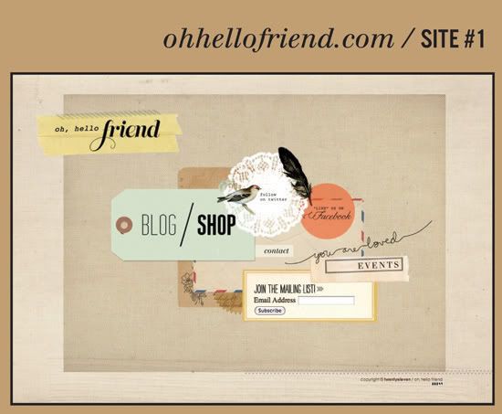
I liked the idea of everything being on 1 single page, so this design just has all the single links and doesn't need any additional pages. It takes you to twitter/facebook/blog/& shop - even the mailing list form is here. Simple + straight forward. The only extra page needed is the event page. At first I liked the design.. then I took a break and came back to it and wondered if it just looked like one big jumbled mess? Now I'm not sure what I think of it, I think I still like it, but what do you think?
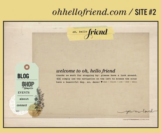
So then I came up with this design - the usual navigation layout and individual pages to go along with each link. Added in the about, connect, & shop page. Nick likes this one better, but it just seems like so many unnecessary clicks + links when it can fit all on one page, you know what I mean? Still - I like this layout too.
So I need your vote! #1 or #2?
Always love hearing your thoughts and getting your input.
Thanks friends, you're the best!


Though I love #1 aesthetically, I think #2 is more welcoming for visitors. =) Either way, you did a great job!
ReplyDeleteThey are both amazing. #1 is more unique and seems to be more "you." However, #2 might be easier for everyone to navigate. Can't wait to se ethe finished product.
ReplyDeleteI personally prefer number one. It does not seem difficult or confusing to navigate, to me (though I am quite used to the internet, as not everyone may be...). Both are nice, however, if you go for two, I would add a pop of color, or some other visual interest, on the main 'kraft paper' part. Maybe a border around the wording, or having the wording sit in a white/colored box.
ReplyDeletexoxo
I like #2 better; it's a lot easier on the eyes and the mind in terms of figuring out where to navigate to.
ReplyDelete#1
ReplyDeleteI much prefer #2. I would play to the lowest common denominator (aka, the not the most computer savvy person) and go with the option that is easiest for navigation.
ReplyDelete#1 seems to reflect more of your work - from what I have seen on here anyway :)
ReplyDeleteLoving #2. Simple and lovely, but still totally conveys your brand and that layered, scrapbooky feeling that I associate with Hello Friend.
ReplyDeleteI would have said 1 at first glance, but after clicking around on #2, I like that much better, it's prettier and takes me to all your shops - there is much more potential for change with number 2 :)
ReplyDeletei love #1 and i'm super duper plain so i think that's saying a lot. and like another commenter mentioned...i think it looks like "you" too!
ReplyDeletei definitely see your style in number one but i prefer number two! i think it's easier to read.
ReplyDeleteI like #1. With #2 my eyes don't know where to look first - up, middle or left?
ReplyDeleteDef. #2.
ReplyDelete#2 simple and easy, but it looks like totally you!
ReplyDeleteI like number one better. I think it is easier to navigate with everything on on single page, so we don't have to click titles to sub titles and all those little things. Moreover, this way of arrangement is more unique!
ReplyDeleteI'm loving number 2, but I am finding the tan text on your about page hard to see, maybe a darker color, but number 2 for sure!
ReplyDeleteLove Number 1 - everything on one page is a great idea!
ReplyDelete#2 gets my vote!
ReplyDelete#2
ReplyDeleteI feel like #2 is better for people to navigate through. Hate for your readers to get frustrated if they can't figure out #1's layout! Although, I think the layout of #1 is done very well. :)
ReplyDeleteNormally I am the type of person who would choose #2, but #1 really pulls me in and gives me a better idea of who you are. I think as long as you keep the links big and bold (like you have blog/shop) its all good!
ReplyDelete#2!
ReplyDeleteI like #1!
ReplyDeleteI like site #1.
ReplyDeleteAs much as I love #1, I think that for the purpose of your website, #2 would be better suited because it's simple, not as busy as #1 (easier to navigate for those unfamiliar with the blogging world/html, etc.) & of course, while keeping it simple, your cute accents are still seen in the bottom left corner.(:
ReplyDeleteI do think number 1 is cute and I can relate to wanting everything on one page. The second design feels more streamlined. Whether or not that's a good thing is a matter of opinion :)
ReplyDeleteI love the site 2. It looks simple and tidy...
ReplyDeleteI like number 1, it looks like a scrapbook page, cute!x
ReplyDeleteI prefer number 1. It's nice to see something different for a change.
ReplyDeleteHowever, I do like the "connect" page from number 2. So perhaps you can have that as well? It's nice that you can click on to Pinterest, Formspring etc. but don't have to clutter up the front page with these links as well.
I really like #2. Feels more like a site! :)
ReplyDeletealthough #2 is much neater/cleaner look, I love how unique #1 is. So, I say #1 :)
ReplyDeletei love #2! i find it easier for navigation and cleaner!
ReplyDeleteI *think* I like site #2 better. It's cleaner and a bit easier to follow, while still retaining your creativity and the feel of #1. :)
ReplyDeleteI love #1
ReplyDeleteWhat a tough decision. I think I'd go with #2, though! It's a bit cleaner with the navigation. #1 is so adorable, though!
ReplyDelete#1 seems more you...but #2 is easier to read. I'd go with #2.
ReplyDeleteI absolutely love #2!!
ReplyDeleteHello,
ReplyDeleteI think the new design looks wonderful!
My personal favorite is #2 I think its simple and easier to navigate but it keeps the handmade quirky edge to it :) I also really like the little description under the title too
But which ever you choose will look lovely :)
Stacie x
Curious Damsel
I love #2. Clean and fresh.
ReplyDeletesuch a toughie. 1 is cooler but 2 is more user friendly and i think that at the end of the day user friendly is the way to be. maybe you can make the headline of 'welcome to oh, hello friend' a little jazzier on number 2?
ReplyDeleteFor site navigation purposes, #2 is simple, easy and still aesthetically pleasing. Although, I love the little birdie and doilie on #1. Cheers to making both options lovely. I vote for #2.
ReplyDeleteI love the simplicity of #2 but my vote goes to #1. it's like a nice paper collage (:
ReplyDeleteI usually go for the clean and simple look, but I think #1 is more "you". It just seems more beautiful and interesting.
ReplyDeleteWhat if you made a compromise between the two designs? I love the letter to readers of #2, so what if you added that to #1 to give some context to the collage of links you have below. #1 is so unique, it would be a shame to throw it out. The other thing I like about #2 is the white space, but since it has so much, maybe bringing things in a bit would make it feel tighter and give it some of that cohesiveness that you like about #1.
ReplyDeleteIt's always fun to see the design process behind the scenes! Thanks for sharing.
They're both beautiful, but #2 plays to my eye a bit better.
ReplyDeleteI like #1...only I'd make the blue tag smaller and only feature 'blog' or 'shop' and add another element for the remaining blog or shop link.
ReplyDeleteI love the design in the first layout, but I like the idea of an about page, which is only on the second design. Would it be terrible to add one separate page to design #1? I think it would be useful for new customers just browsing to know a little about before they click on shop or blog. A preface if you will.
ReplyDeletedefinitely #1, #2 is not very pretty :(
ReplyDeletethey are both beautiful! and while i love #1, #2 will be much easier for the majority of your visitors to navigate around your site. i would love either one though!
ReplyDeleteI like #1. It's fun, whimsical and includes a doily!!!
ReplyDeleteI like #1 better, but even it could use some changes. Maybe the paragraph that is in the middle of #2 can go to the right of the yellow highlighted "oh, hello friend" in #1 but after the heart, maybe get rid of "read. follow. like...."
ReplyDeleteThen the middle section could be more of a geometric shape. Maybe your favorite shape; doesn't have to be a square or a rectangle. But the mass in the middle of #1 does look messy to me.
The lower right corner of #2 is fine. "you are loved" looks better in the lower right corner, as if it's the "signature" of the page.
The middle mass of #1 should have the following with different backgrounds of each like you have now in #1, and so therefore Blog and Shop should not be on the same background:
Blog
Shop
Events
About
Join
Follow
Like
Contact
No: Read, Email, or Connect.
For "follow" are you legally allowed to use Twitter's bird logo? For "like" are you legally allowed to use the FB logo? If so, try that.
Peace,
Jami
P.s. Are you going to do a 13 by 2013 and start it in January 2013 instead of late in the year?
I like them both, but I think #2 is much easier to follow - so I'd probably go with that one.
ReplyDelete#2 :)
ReplyDeletewow! i love both of these! i love the style of the first one but i think navigation-wise the second site is much more user-friendly. can't go wrong either way though!
ReplyDeleteBoth designs are beautiful, but #1 keeps my attention longer. I like pages where always I can explore some new details. :)
ReplyDelete#1!
ReplyDelete#2... simple and beautiful!
ReplyDeleteThe first one is really cute, however, for functionality, I really like the second one better. It's still very you and adorable, but a little easier to navigate and less overwhelming since there's more free space.
ReplyDeleteNo. 1 is my preference. I like it because it's not your typical navigation page and has a lot of personality.
ReplyDeletei like no. 1! they both look beautiful though :)
ReplyDeleteI love the look of #1 but I think navigation is easier on #2.
ReplyDeleteI like #2!
ReplyDeletei like number 1
ReplyDeletemy vote is for #2. much more streamlined and easier to navigate. plus, i like that there is a welcome message from you, front and center.
ReplyDeletei'm drawn to #1 more because it's a nice departure from a typical website layout. really loving the textures/elements you used! would love to collaborate with you on future design projects i have in store :)
ReplyDeleteI like number 1, it gives out a vibrant energy and it doesn't look so static compared to number 2.
ReplyDeleteI love them both but I'm more drawn to #1 since it's more organic. Both are lovely but I think that one is the strongest and it's more unique. :)
ReplyDeleteI prefer Number#1, have a nice and sweet details, I think it is more of you in this aproach. Is very easy to acess the item we want. The number 2 is quite simple to acess the different links, but not describes your atmosphere.
ReplyDeleteSmiles for you:))
definitely number 2 for me. It just looks easier to use.
ReplyDeleteHi Dani,
ReplyDeleteGreat aesthetic! I must say number 2 is my favourite - it looks less cluttered. One option, to avoid loading a new page with every click, is to keep the website "fixed" and have the new content appear in the designated area without loading a new page. Not sure if I made myself clear :) I'd be happy to help you achieve that if you want.
Love always,
Nancy
#2 because it is really refined !
ReplyDelete#2! It's scintillating without being overwhelming. Beautiful!
ReplyDelete#2!
ReplyDeleteI like #2! It has all the style of #1, but less busy.
ReplyDeletei love them both but i think #2 can say a bit about what your all about for the new people.
ReplyDeleteDefinitely go with 1# i've read your blog for a little while now and i think it just displays your style so well
ReplyDeleteThis comment has been removed by the author.
ReplyDeleteONE! ONE! ONE! :)
ReplyDeleteCause it's more harmonic and I like the idea of one page navigation. #2 is beautiful too.
The only thing that could be a "problem" with #1 is that it can only link to one shop and I've noticed you have more than one.
BTW, I love your work. :)
site 1! Love both, though.
ReplyDeleteI really love the unique look of #1.
ReplyDeleteI like #1 a lot but I LOVE #2 because it feels easier to take in.
ReplyDeleteI like both but my vote is for #2. I'm a fan of clean and simple :)
ReplyDeleteI love them both but I will vote #2
ReplyDeleteyou are a very talented lady
Nicolette xo
I think the first one is more you
ReplyDeleteI vote for #1! It's special. And very aesthetically pleasing. Both are nice but I definitely prefer #1.
ReplyDeleteI vote for #1! It's creative, I love how the Blog and Shop stands out - only thing I would change would be to make Events stand out a little more. Although the second one is clean (and normally I am a big proponent for clean and minimal design), I love the first design as a landing page for visitors because it's so much more fun - I am more compelled to click to find out more by the first layout!
ReplyDeleteI love them both! I like the coral/pink in the first one but the layout of the second one better.
ReplyDeleteAlthough I really like #2, I LOVE #1! maybe make the blue tag a bit smaller? It really stands out from other website..it's so creative and so you Danni :)
ReplyDeleteOh what a lovely layout! Although I love them both, experience has told me that #2 is more user friendly :)
ReplyDeleteBoth are nice but I like the simplicity of #2. It looks more organized and it's easier to read.
ReplyDeleteI like the first better.
ReplyDeleteYour design skillz make me swoon. (Yes, that's skills with a "z"...that good...) ;) I like the second one. But only because the main reason for the website is to direct people elsewhere. The second design is cleaner and easier to quickly get to where you need to go. Otherwise, I would have chosen the first, because I like the scrapbooky/layered look...
ReplyDelete:)
Definitely the first! It is so much more an embodiment of you :)
ReplyDelete#1!!! :)
ReplyDeleteI don't know if you decided yet but no. 1 is stunning!!! Please go for that one... LOVE LOVE LOVE
ReplyDelete#2 is easier to navigate and pleasing to the eye.
ReplyDeleteNo. 1 it's perfect!!! All you want to share is in this page and it's pretty =)
ReplyDelete