


So I finally got around to working on a design for my ohhellofriend.com website! I don't know that this site serves much of a purpose other than just placing the web address on my business cards and directing people to the blog/shop from this site. But it's been a long time since it's had any design on it. I came up with 2 designs .. and I thought I'd ask you which one you like better! :)
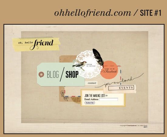
I liked the idea of everything being on 1 single page, so this design just has all the single links and doesn't need any additional pages. It takes you to twitter/facebook/blog/& shop - even the mailing list form is here. Simple + straight forward. The only extra page needed is the event page. At first I liked the design.. then I took a break and came back to it and wondered if it just looked like one big jumbled mess? Now I'm not sure what I think of it, I think I still like it, but what do you think?
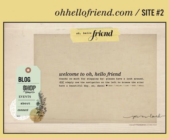
So then I came up with this design - the usual navigation layout and individual pages to go along with each link. Added in the about, connect, & shop page. Nick likes this one better, but it just seems like so many unnecessary clicks + links when it can fit all on one page, you know what I mean? Still - I like this layout too.
So I need your vote! #1 or #2?
Always love hearing your thoughts and getting your input.
Thanks friends, you're the best!


